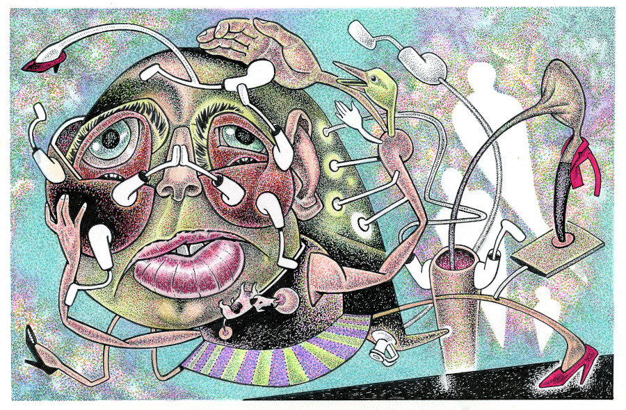
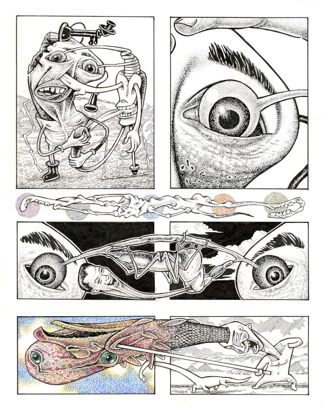
Voice of Jellies
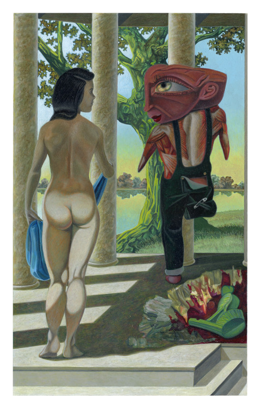
Contrived Exits
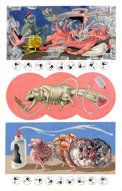
The Tin Ear
Of The Moment: At the time of the 2002 LA show, my Blender Kitty comic strip was still running in The New York Press. Shortly after the show, a friend launched a website on my behalf. For content, she posted images of my paintings from the La Luz de Jesus Gallery website. I purchased my first iMac computer and scanner around this time with funds raised from painting sales, and part of my first order of business was to take control of the website, then hosted by GoDaddy. I cannot recall if the site was already named blenderkitty.com, but comics joined paintings as featured content.
Click images to enlarge. Please read THIS carefully before contacting me about purchase information. Contact: teaguemichael5858@gmail.com.
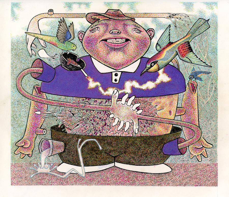
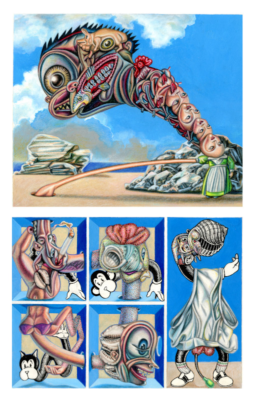
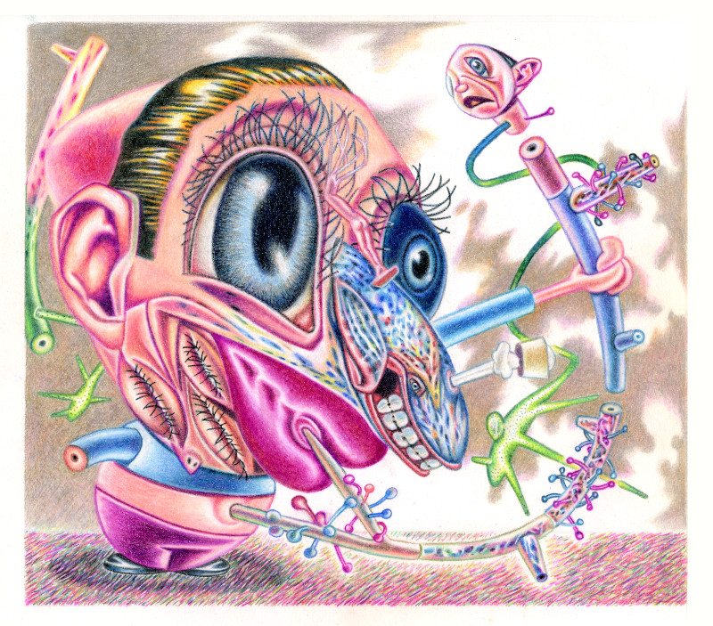
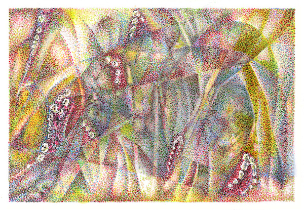
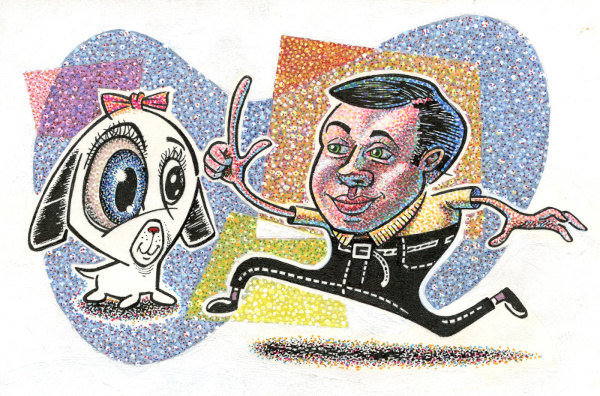
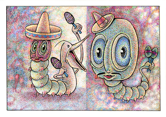
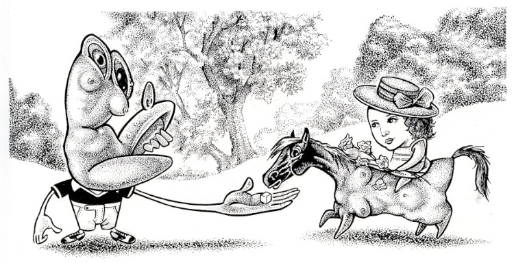
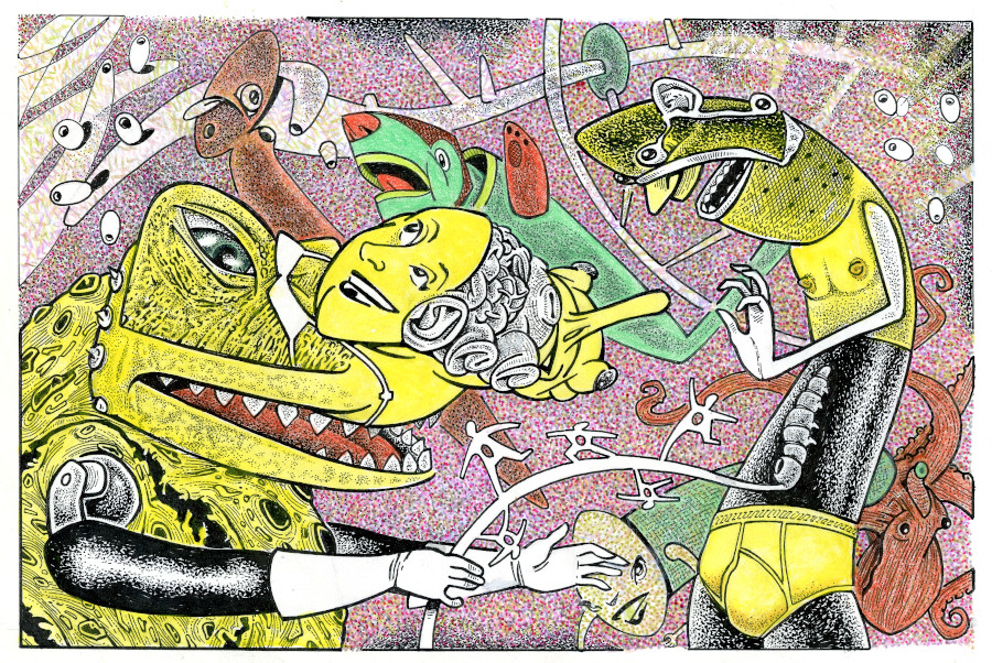
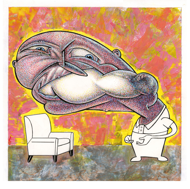
Materials and Media: All works on paper presented on this gallery page are mixed media, which includes graphite pencil, color pencil, color marker, pen and ink, collage, and acrylic paint. Around 2014, toned paper and white charcoal were added to my graphite drawing toolkit. Examples of this technique are showcased on my second gallery page.
Koh-l-Noor rapidiograph pens are unexcelled for drawing, but due to their temperamental nature and difficulty in cleaning, I stopped using them years ago in favor of disposable archival pens.
My preferred paper for drawing is Strathmore’s 500 Series Bristol board (Flat Plate Finish), and less so the 400 Series. The 400 Series is sold in tablets, and has a buff tone coloring. I have used the 400 Series in sketching and cartooning, although the color tint must be removed when scanning to create black and white line art.
Weirdly, I had forgotten that the 500 Series originally had a milder version of this buff coloring. All art presented in this section was made on the 500 Series, but several older drawings were created on this older version of the board. In reviewing these works to get their measurements, I thought the paper had aged and discolored—no, this is how it was manufactured! Somehwere along the line, Strathmore switched this series to stark white. At the time I complained to the art store who supplied me with my drawing papers about this change, but given my brief horror in thinking my drawings had yellowed, I believe Strathmore made the right choice in changing colors. (Nowadays, the 500 Series is also sold in tablets.)
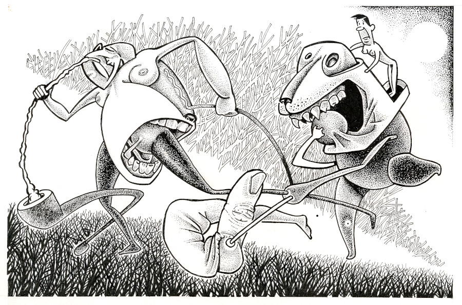
Pens versus Paintbrushes: I have quite a collection of disposable pens, but I do not reflect much on them. A similar indifferent view exists regarding paintbrush brands. My pen collection includes Artline, Winsor & Newton, Micron, Staedtler, and Le Pen. Micron’s nib is hard and blocky and sometimes leaves a double line. I do not like these pens. I prefer pens with softer tips that ride evenly over smooth paper. Le Pen is my favorite.
Brush and Ink versus Fine-line Marker: I wish I had developed the ability to use brush and ink since I admire comics artists who work in this style, especially Charles Burns, Jim Woodring, and Al Columbia. But here you have to choose between a look and level of detail—and I love detail too much! Even the smallest brushes (Winsor & Newton University Series, 000 is the brush I use most often in oil painting) leaves a mark many times too big for the finest detail on paper.
You can, of course, use both approaches in a drawing (brush and ink and fine-line marker), but the look may be incongruous since the latter negates the bold simplicity of the former. Brush and ink is dynamic precisely because it is clean and bold. This boldness, however, does not extend to pigment: India ink dries flat and dull, and is a shade lighter than true black. Disposable markers hold their blackness due to the inclusion of varnish. One may perceive a mild conflict in tonality where the two inks are seen side by side. A black and white stack camera will equalize these differing shades of black for print publication, while gallery track lighting will be less accommodating.
Interestingly, Le Pen makes a brush-tipped black marker that holds its tonality. I have experimented with this pen, but working with brushes as drawing tools is a whole other vibe. One must be surefooted and confident with them, since mistakes are difficult to correct.
Deconstruction Within Works on Paper: In my portfiolio pages, I discuss my growing ease with destroying early artwork, and also my willingness to cut up failed paintings and drawings and repurpose them for collage. This destruction ceased two decades ago because I became better about heading problems off at the pass, but I still use collage occasionally. My disposition has also made me open to other novel remedies in problem solving.
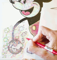
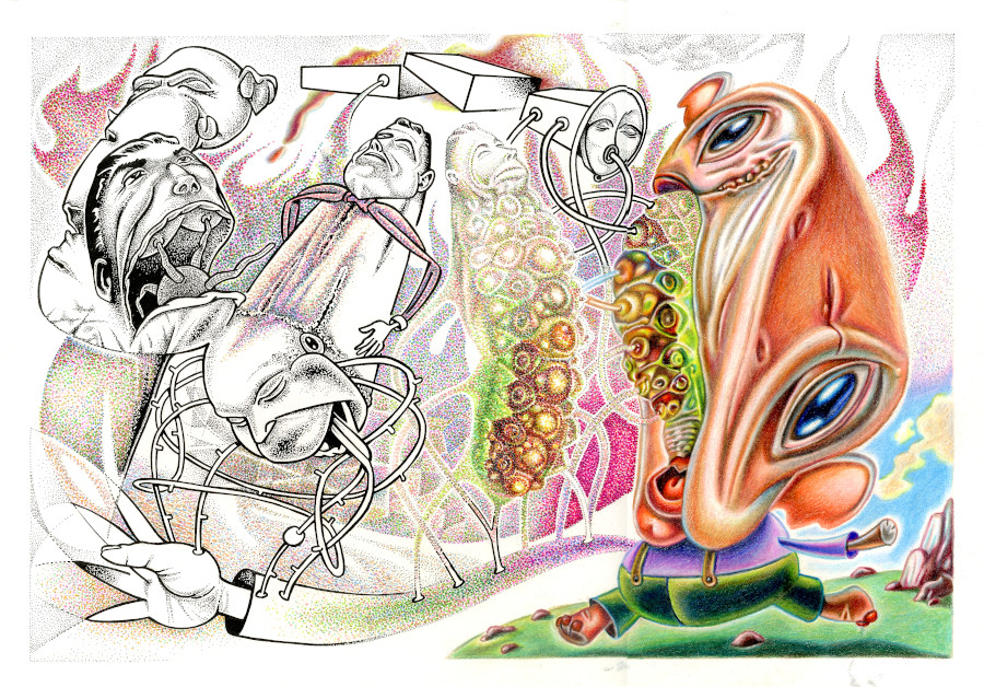
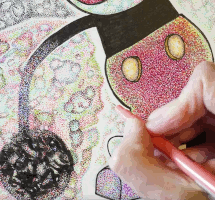 Here is an example from the YouTube time-lapsed completion of my drawing, Maus Falle. During the course of making this film, I had cataract surgery performed on my right eye. There were complications due to me having an underlying corneal disease, Fuchs Dystrophy, which clouded my eye and delayed recovery by eight weeks. Meanwhile, my left eye still had its cataract—and it was the worst of the two eyes!
I could barely see to draw this distorted image of Goofy in the lower left hand corner of my drawing. I decided not to have two images of Goofy in this work, so obliterated this image’s contours with India ink. Later, a layer of my customary pointillist dots were added to ornament the blob, as seen in the completed drawing in the second image.
Trial and error has become a feature—and not a bug—of my creative process. More so once I began “documenting” my work process through time-lapse YouTube videos in 2023. Still, a good deal of design is worked out before the camera starts rolling.
With my background in fine arts, I am always thinking about how art will appear to the viewer hanging on a gallery wall, and whether the artist working on paper is okay, in this context, with his non-photographic blue markup pencil and other corrections being seen. I have attended a few gallery shows where a cartoonist’s work was exhibited, and the rough finish of the storyboards, which is both the prerogative and necessity of a cartoonist in preparing his art for print media, adds a curious intrusive layer to the experience.
I once attended an art opening where a MFA printmaker nailed his etched metal plates to the wall. They were beautiful, and (frankly) more interesting than the prints lifted from them. This idea of showing one’s rivets and solders has been around for a while in artmaking, and coopting it into the domain of Postmodern deconstruction was an obvious next step. (I discuss alternative comics artist Al Columbia and his distinctive use of this technique in my comics portfoilo pages.)
Current Landscapes/ Back/ Home
Copyright © 2010-2023 Michael Teague. All rights reserved.