Art School Portfolio Four 1983-1997
Graduate School 1986-1987
Begrudging Acceptance: The only thing better than going to art school is getting thrown out of one—or so this was true for Salvador Dali.
And yet, my experience as a graduate student at Indiana University’s (then) prestigious painting program of 1986 was that I got to see real paintings up close, and not merely as pictures in books. The third dimension of oil paint rising off the canvas like a topographical relief came as a revelation to me, although I was so obstinate that the full impact of this revelation was not realized until later. Texture has only been achieved intermittedly in my paintings since then, though I now understand that the objet petit a of a painting resides, in no small way, in its physical intrusion into our settled world.
Hover to find linked images.
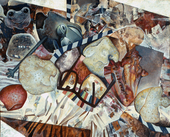
Fish and Gravity (1986)
I continued to work in my experimental style during my first year of graduate school at Indiana University, Bloomington.
This painting was featured in a group show in IU’s SOFA Gallery during that first semester. Visiting artist and renowned sculptor, James Surls, gave a lecture in that gallery, and when asked what he thought of the exhibit, chose only my work to spotlight. He said (and I remember it): “I should not like this painting, but I do.”
Songbirds (1986)
During my first year of graduate study (though mostly my first semester), I struggled and flailed in my small windowless studio. This is the better half of one large canvas that never made its way onto a stretcher. Songbirds was photographed before it was destroyed.
My work process was evolving in relation to works being created by fellow painters in the program. My color selection was somber, and figurative elements were shredded. I ended up going back to figurative subjects in later work, but did not achieve a complete reset until I returned home to Memphis over the summer and reabsorbed the enthusiasm that had infused much of my undergraduate work. These works are presented in a separate section below.
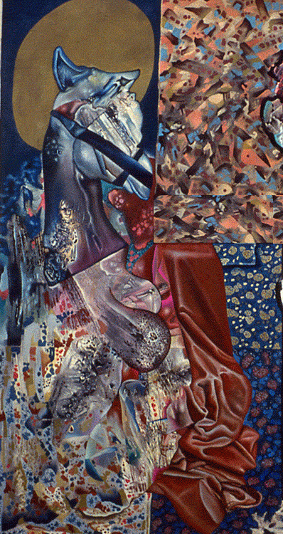
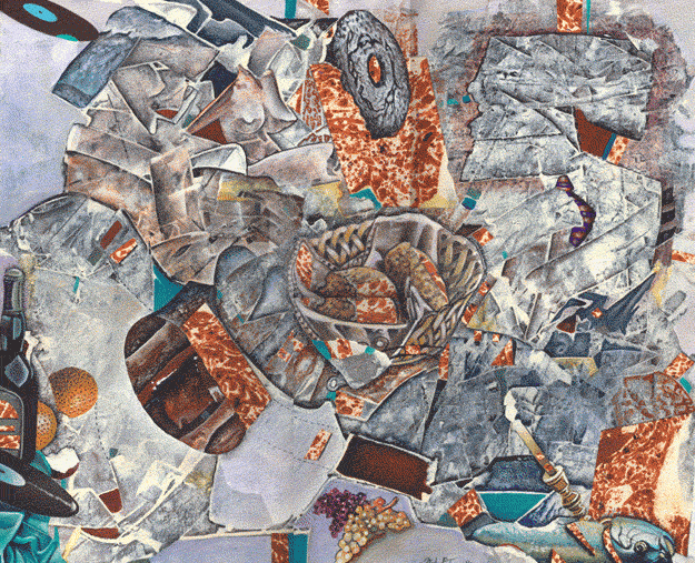
The Letter (1986)
Oil, acrylic, and cloth sculpture. This painting is thematically linked to Killing Waters.
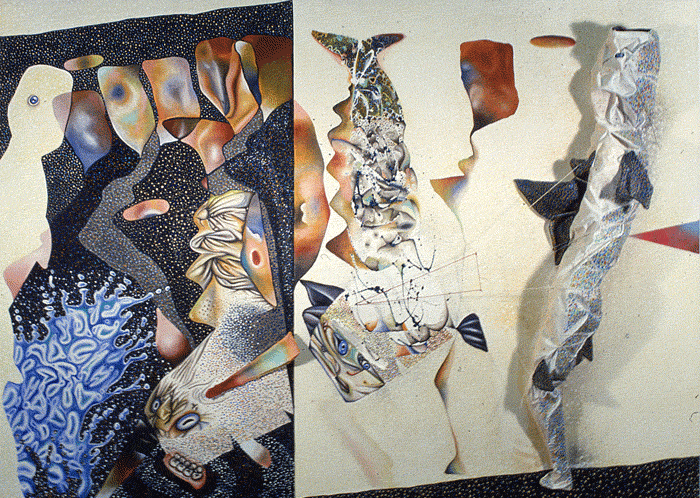
Killing Waters (1986)
The pattern painting here is similar to how I worked in Songbirds. This pattern connects back to Lantern Coffin and The Self from the previous page. I was attracted to busyness, like white noise, as if I was trying to paint the firing neurons in my head.
Killing Waters was criticized for its pattern, which professors did not see as integrating well into either the violence of the picture or the landscape. Fair points. I was distracted by a love affair gone wrong back in the graduate dormitory, so there was that, too. Here the pretty landscape lends its colorfulness to the water, which is speckled with drops of blood.
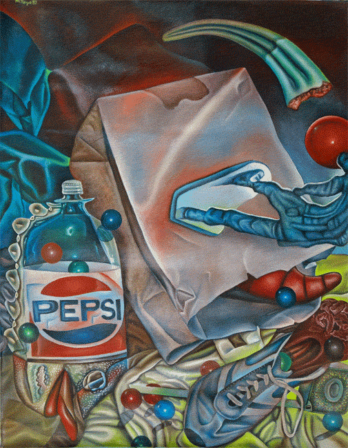
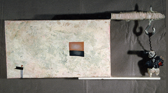
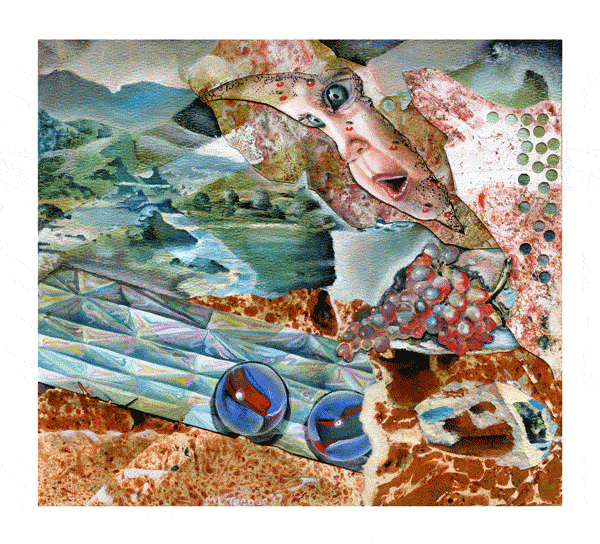
Fowl Lick Sin Bowl (1986-1987)
This painting was finished during Christmas break at home. (Less distraction meant more concentration.) I was kind of lost, and realized that my buckshot scatter approach to artmaking was not working well in an art program designed to see linearity in one’s progress.
On arriving home for the holidays, I was happy to see my mother recovered from an illness that marred my last full year at home, yet my beloved dog had experienced a stroke while I was away; my mother kept him alive so he could see me return. My family put Benji to sleep after I returned to Bloomington, and I was more heartbroken than I could have ever imagined. The only painting I remember creating in my second semester was a tribute to him.
Almost everything from my first year of graduate study was destroyed. When I returned home again for the summer, things were about the change.
The Summer Paintings 1987
The Pivot in Style: I am an engineer first and foremost. When I returned to Pine Hall to begin my second year of graduate study in 1987, I had seven new works to decorate my new, larger studio: four paintings and three works on paper. Everyone in the program was shocked and pleased by my radical transformation.
Nightmare in Rubber Clad (1987)
This is an early work on oil ground, which marked a change in my approach to painting. This is also the first painting I made using Rapid-Set painting medium (more on this later). With this work, I sought to reproduce some of the painterly effects achieved by my fellow graduate candidates. The compositional abstraction is likewise a nod to their school of thought.
My ground was a calcium carbonate oil primer.
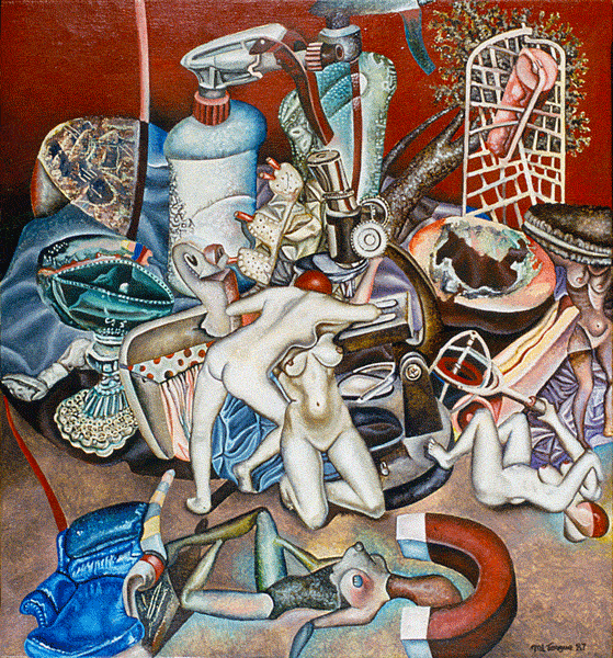
Pagan Women and Applied Science (1987)
Among other things, my color sensibility changed over the summer. Earth tones and Mediterranean pigments replaced bright primary colors.
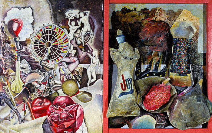
Ancient Cleansers (1987)
This was my last cloth sculpture painting. It is presented in counterpoint to the left hand side of the picture, which is in my new style. In making a split painting, I did not think I was showing where I came from as an artist, and to where I was going, but it kind of looks like that.
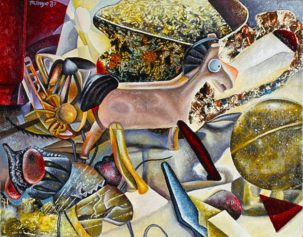
Modes of Fossil Thoughts (1987)
Picnic Minus Forks (1987)
Infant’s Tilt Upon A Teething Sea (1987)
In this work, and the one above, I used an oil-and-water transfer technique for creating marbleized paper. This paper was cut up and mixed with other collage elements that were cannibalized from destroyed acrylic paintings on paper.
Here Today, Gone Tommorow Techinque: I see throughout my early painting history an inability to maintain focus on developing skills, or to keep track of them over time. By 1985 I was achieving better results from observational painting of still-life subjects. However, I was trying to serve two masters at IU: painterly abstraction and fine-detail realism. My compromise was to dabble in a little of both, which is to say not enough was done in either to please opposing camps.
The works of paper, shown above, are my best attempts to think through this impasse by establishing clear boundaries between realism and carefully curated abstraction. By being at a smaller scale, painting on paper with thinned acrylic paint allowed me to channel brushstrokes into narrower corridors. Precision was built into the process. Working at a table was also to my advantage, since years of drawing cartoons at the kitchen table was bred in me. None of my fellow graduates worked on paper as I remember, or at least not ambitiously.
In later years, I came to regard my easel paintings from this period as unresolved. I confused sloppiness with modern style, and this license migrated, regrettably, into concurrent realistic subjects. Graduate school is to blame for my wholesale retreat from technique. I tried to copy the loose painterly style being practiced by fellow graduate students from well-heeled art schools (Yale, Tyler, etc.), and in so doing shunned spit-and-polish. It was a decade before I rediscovered both a passion for easel painting and my better painting practice.
This being said, I regard my time at Indiana University as necessary to my future development as an oil painter.
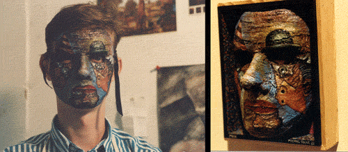
Halloween Mask acrylic on plaster, 1987. Here is another example of how I thought differently when painting with acrylic paint.
Figurative-Abstract Painting of the 1980s: To be fair, this was the era of figurative-abstract painting, led by the likes of Frank Auerbach. This style’s influence was prevalent at Indiana University. Professor Robert Barnes navigated these boundary waters successfully, but mostly because figurative-abstraction was friendlier to abstraction than it was to figuration. Within the next decade, IU’s painterly philosophy was all but gone, to be replaced by… I know not what.

The above splash drawing from my book of 1989-1991 comics, Dreams of Bad Milk, is essentially an abstract painting drawn with pen and ink.
Hindsight is 20/20: By the time I discovered Pop Surrealism in the late 1990s (see the Artwork Gallery 3 page for my parallel development alongside this movement), I thought art school was in my rearview mirror. As should be evident by these remaining portfolio pages leading up to this Pop Surrealism epiphany, art school never left me.
In my alternative comics of the late 1980s through the late 1990s, a strange admixture of clutter crowds every page of drawings and writing. Busy is a word that comes to mind. Still, comics are generally preoccupied with foreground given the element of storytelling, where backgrounds are afterthoughts, or left out. Foreground thinking and part thinking of this type date from the age of Hieronymus Bosch. His backgrounds are similarly unresolved behind his field of tiny figures.
With abstraction, movement is key. Brushstrokes are pushed to the front of the painting as a rule, and tend to flow and weave throughout the picture like a flock of birds, or like the scatter pattern of shattering glass. This sort of organization follows a comics artist’s preference for dynmaic splash pages.
Many pioneers of Low-Brow/Pop-Surrealism, such as Robert Williams and Todd Schorr, had backgrounds in either comics or illustration. With Robert Williams, he mocked the art world that excluded him in the 1980s for painting realistic figures. His mockery consisted of including mashups of cubist flourishes in the margins of his in-your-face cheesecake art. Strangely, he continued to use this modernist-appropriated technique as a framing device for his highly detailed, pictographic paintings going forward.
My paintings and drawings were only a little less constipated than my comics, but I too appropriate a modernist mindset when organizing my workflow on the canvas. Depth of field—by making backgrounds (landscape features) subtractive in color and tone; or, as with drawing, rendering backgrounds with fine lines when compared to bolder outlines for foreground objects—is a practice that has only emerged in my work since 2010.
Still, my work of the late 90s was in step with Pop Surrealism at that time. Since then, the movement has been overrun by conventional thinkers: Backgrounds in paintings aspire to nothing more than naturalism. When compared to my mature drawings and paintings of the 2000s, it is easy to see how younger artists may not be able to relate to the history and influence of modern art on what came immediately after it in the 1980s. I am a dinosaur by even my own late adapted post-modern eyesight.
×
![]()
×
![]()
Next/ Back/ Artworks Portal Page
Copyright © 2016 michael l. teague all rights reserved.